Monday 9 May 2011

Final 45 Branding


Once I had created the vector objects I put them on the 45 cardboard cutouts. This is the final result for the second piece of branding.

Vector Objects

After seeing that actual party objects did not work on the photographs, I have decided to make vector objects. The advantage to doing this is that they can be scaled so they are in proportion with the cardboard cutout and I can make them with a texture over the top of the illustration so it fits in with the cardboard theme that in running throughout the campaign.


Making the 45


When I was photographing the cardboard I added party objects to the cardboard cutouts but this did not work. The objects were too small in proportion to the objects and it does not have as great an impact as I wanted.

Second Branding Design

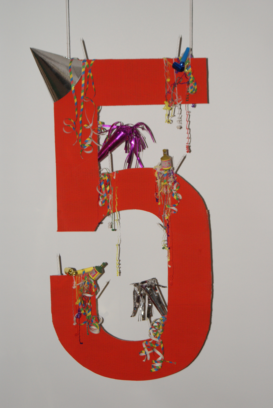
As well as the star logo that I have designed I thought it would be a good idea to have another piece of branding that could be used along the main logo. This second logo would about expressing birthday celebrations and to mark this occasion.

The design for this will be 45 made out of cardboard so it fits in with the other cardboard objects.

Logo Development

01


02


For this logo I have added a subtle duplicate of the star in a darker colour in the middle of the main star to add more detail to the logo.


03

 I have made the middle star darker. This has more of an impact and looks more dramatic.


04


I have started messing around with fonts seeing which works best. This font does not work as it is a default font and is not exciting and difference.  


05


This font works better as it reflects film and cinema but it looks too small and doesn't grab attention. The glow around the writing doesn't work. 


06


I have put 45 in the centre of the star so it can be bigger. I think not splitting the text up and having it all across the banner looks better.


07

This font works a lot better as it is a fun, bold, easy to read font. The only thing that needs changing now is the font colour so it stands out and is easy to read.


Final Logo

 
It is a fun, exciting logo that is representative of films and cinema.

Making the logo


Ideas

The idea or the branding is to use a star with a banner across the bottom. The reason for the star is because it is telling people that if you enter the festival then you can become a star. Stars are also closely related to film.


Here is some inital ideas for the branding.